First of all I want to thank everybody who voted for, read and liked my previous post about DevConf.cz 2016. With your support I won the blog competition and got a bag of cool swag, including an xxxl sized t-shirt :p
That said, today I want to tell you and ask for feedback for Fedora 24 Alpha Release Wallpaper. Let me guide you for the process of wallpaper creation first. As you might know, before the final release, we have Alpha and Beta releases, for which we already have to package wallpapers. Between Alpha and Beta we collect feedback and make changes accordingly. You can take a look at previous versions wallpapers on their wiki pages: f23_artwork, f22_artwork, etc, etc. There you can also take a look at banners (based on wallpapers) and supplemental wallpapers chosen by vote. By the way, everybody is welcome to submit supplemental wallpapers! If you have pics to share, read this article and contribute. The deadline is in April, so there’s still time.
Back to F24. We started the discussion maybe a bit late. I would’ve personally preferred more time to think and contemplate 😉 Also I felt that not as many people helped as I would’ve liked to. Basically, it was just 3 of us: me, gnokii and samo8. And also I poked some people and asked them for feedback, which was generally positive, so yay! Ok, so we had our initial discussion on IRC in #fedora-design channel, where it was decided to go with the idea of space. If you’ve used Fedora for a while, you might have gotten the general impression like I did;) You can see on wiki, that “Release has no name”, so we had to improvise.
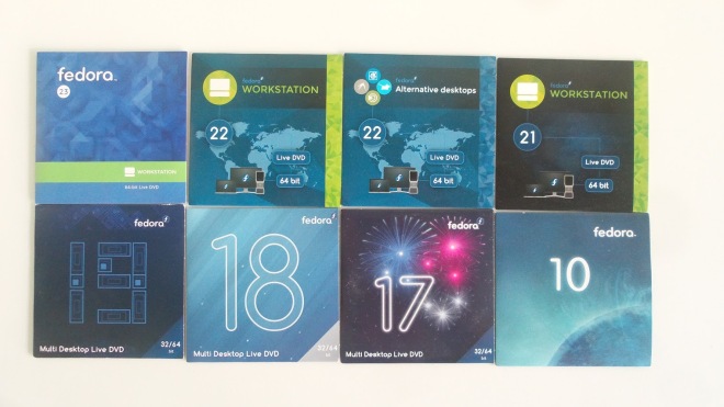
First I took a look at previous wallpapers and whatever CD sleeves I have lying around:
And naturally thought of space and stars =) My initial design was to take a pic of starry sky and put an overlay pattern over it, like so:


The triangles and hexagons are mine, and the pattern Sam created in Blender, I think. So we looked at that and thought a couple things: triangles were a bit weird, pattern a bit outdated and just having 24 up there too straightforward. Hmm..
Then we started thinking about how to hint at 24, but not write it directly. One of the ideas was: there are 24 hours in a day -> who came up with that -> hmm, I guess ancient Babylonians did -> ok, so let’s write it using Babylonian numerals. We also decided that creating a starry sky ourselves in Gimp would give us much more freedom and independence from the restraints of the photo and make the artwork completely original and new. As you might know Gimp has quite some plugins, like Starry sky, for example, or Stars in the sky. I actually used both with a combination of renders, such as Clouds and Plasma to give the picture depth and color. I played with layer transparency, blurs and overlays to create various effects. So we did a couple of those and I even tried gnokii’s clock:


The clock was too much for the wallpaper, you can see it on the banner, though =) All in all, this still wasn’t it!
So we thought some more and I came up with an idea of a constellation. Here you can see a first draft with the vector stars I made in Inkscape and a much improved stars made by custom-made brushes in Gimp.


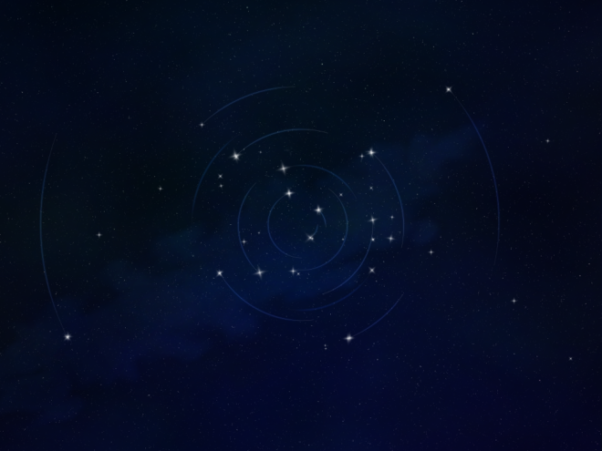
We thought a bit more and got rid of the stripe there, as it was reminiscent of precious releases and added instead a cloud in the background. Gnokii also insisted on idea of light traces, so I searched for images of star trails and was absolutely inspired to make them go in circle. After some play with colors and overlays and pasting Inkscape paths into Gimp we finally agreed on this image:
It has now been packaged and uploaded to Wiki, and we can collect feedback before the Beta release.
So please, if you have something constructive and helpful to say, please, comment. I want to underline the word constructive here, too! and considerate! Thank you 🙂

[…] Fedora 24 Alpha Wallpaper […]
LikeLike
It looks great, and I like how you’ve gone through the design thinking and workflow behind it.
LikeLike
thanks)
LikeLike
[…] for Fedora 24 will look on their desktop. Masha Leonova from the Fedora Design Team recently blogged showing what the wallpaper will look like in Fedora 24 […]
LikeLike
[…] for Fedora 24 will look on their desktop. Masha Leonova from the Fedora Design Team recently blogged showing what the wallpaper will look like in Fedora 24 […]
LikeLike
Hi, I liked it but I was liking more the direction you were taking in the Babylonian path. As far as I know that isn’t usual, so it would be mind blowing!
I know you invested a lot on this, but it seems OK. But I know you can accomplish much more than that!
Thanks for the hard work!
LikeLiked by 1 person
Cool, thanks for the comment! =)
LikeLiked by 1 person
I absolutely love it.
I think it matches perfectly with the overall look and feel of Fedora Workstation. And it looks amazing on my 27″ inch. monitor.
Many, many thanks for the hard work.
// Giulio (juliuxpigface on FAS)
LikeLike
Happy to hear that)
LikeLiked by 1 person
I really like the Babylonian numerals too, especially mcquwy6.png. The ancient-looking writing is great contrast for hi-tech product.
LikeLiked by 1 person
Seems like a bunch of people do! Thank you for the comment
LikeLiked by 1 person
Very nice! Especially when I think about the new Astronomy Spin to be introduced with 24 🙂 Thank you very much!
LikeLiked by 1 person
Thanks, Christian =)
LikeLiked by 1 person
Thanks for the clock wallpaper! It was amazing on my laptop (although not simple enough for the default wallpaper, there I agree with you!)
LikeLiked by 1 person
Hey, of course! Is it big enough? =)
LikeLike
Yeah, I “only” have 1080p and the image seems to be twice that, so it fits perfectly and has the correct aspect ratio 🙂 Thanks again
LikeLike
ok then)
LikeLike
I really like the (non-blurry) Babylonian text version the best. I have it on my desktop now, and it just looks great! The clock one is my second favorite. I really like the design of it, perhaps the clock itself should be a bit more subtle? That could reduce the slight jarring effect it has.
LikeLike
ok, cool! thanks)
LikeLike
Hex patterns are AWESOME. It’s a very modern look and I think patterned wallpapers are very popular these days. Maybe let the hexagons extend through a space background with an angle like a combination of the very first and third pictures above, but slightly more emphasizing the hexagons. To be modern and sleek you know. The 23’s patterned wallpaper was a very good job, don’t laugh but it’s what attracted and then I started using fedora for the first time. Good job btw! Keep it up! Cheers
LikeLike
Cool, thanks! I kinda like the hexagons, too =)
LikeLike
Interesting read about the ideas behind the design and a stunning work of art! Just one hopefully constructive remark is that star trails can only revolve in one direction as it’s basically a fixed pattern smudged as it rotates around a point. However I can see some stars leaving a clockwise and others a counterclockwise arc.
LikeLike
Thank you for the comment! I actually never thought about it like that, very interesting remark, thank you =)
LikeLike
Hello, i loved seeing the pictures and reading about the way the design process went. I agree with all of the subtleties noticed “clock too much” “inkscape stars not quite right” Like others, i also felt quite drawn to the babylonian set. particularly 86vSVAu 🙂
great job. As for the final choice, I love the background and the moving stars look nice too. At full screen, i’d have a better sense of it too.. the different directions of the stars make it feel like gears.. r or more like living entities.. I suppose it is the clock/time idea that has the stars circling?
I understand this the wallpaper just for the alpha release?
LikeLike
Hey, thank you for the comment!
It is for Alpha, but what usually happens is it transitions with minor to no changes to Beta and then to the release itself.
LikeLike
TBH, I don’t like any of them. I like the current, very abstract pattern ones with the noise in it a lot more.
LikeLike
That’s perfectly fine =)
LikeLike
Very nice, but one big artistic mistake: the star trails must all go in the same direction! The mix of left-hand and right-hand rotation of the trails is incongruous and disturbing.
LikeLike
Artistic vision I call it 😀 Seriously tho, it’s been mentioned, yeah, true, I didn’t think about it that way.
LikeLike
[…] para Fedora 24 buscará en su escritorio. Masha Leonova desde el Fedora Equipo de diseño hace poco blogueado mostrando cómo se verá el fondo de pantalla en Fedora 24 […]
LikeLike